Styling form elements is a pain point when developing web applications. Historically, web developers have had to accept the form controls the browser provided with little hope of customization. However, web rendering engines are increasingly adding hooks through pseudo-elements to give authors some control over the display.
While all of these pseudo-elements are rendering engine specific (and therefore behind vendor prefixes), they can still be handy for customizing the display for that engine. The following is my best attempt at compiling a complete list of the pseudo-elements available in Trident, Gecko, and WebKit. At the time of this writing Blink is a recent fork of WebKit, so the pseudo-elements provided are identical. I am not aware of any form related pseudo-elements that Presto provides.
A couple of notes:
- All Trident pseudo-elements listed here were added in IE10 and will not work in earlier versions of Internet Explorer.
- In WebKit, to style some pseudo-elements you must set the basis element’s
-webkit-appearancepseudo-class tonone. For example, to style::-webkit-progress-baryou must apply-webkit-appearance: none;to the appropriate<progress>element.
Table of Contents
- <input> Elements
- Other Elements
- Miscellaneous
input[type=button]
Gecko
See <button>
input[type=checkbox] / input[type=radio]
Trident
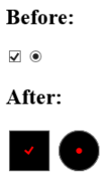
Trident provides the ::-ms-check pseudo-element for checkbox and radio button controls. For example:
<input type="checkbox">
<input type="radio">
::-ms-check {
    color: red;
    background: black;
    padding: 1em;
}
This displays as follows in IE10 on Windows 8:
input[type=color]
WebKit
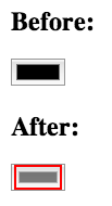
Webkit provides 2 pseudo elements for its color picker, ::-webkit-color-swatch-wrapper and ::-webkit-color-swatch. You can apply a variety of rules to these elements but I haven’t come up with anything useful. Here’s an example just to show it’s possible:
<input type="color">
::-webkit-color-swatch-wrapper { border: 2px solid red; }
::-webkit-color-swatch { opacity: 0.5; }
This displays as follows in Chrome 26 on OS X:
input[type=date]
WebKit
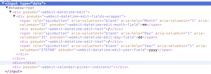
The following 8 pseudo-elements are made available by WebKit for customizing a date input’s textbox:
::-webkit-datetime-edit::-webkit-datetime-edit-fields-wrapper::-webkit-datetime-edit-text::-webkit-datetime-edit-month-field::-webkit-datetime-edit-day-field::-webkit-datetime-edit-year-field::-webkit-inner-spin-button::-webkit-calendar-picker-indicator
Here is the internal structure of these elements:
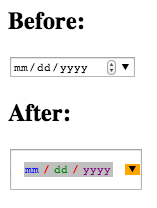
So if you thought the date input could use more spacing and a ridiculous color scheme you could add the following:
<input type="date">
::-webkit-datetime-edit { padding: 1em; }
::-webkit-datetime-edit-fields-wrapper { background: silver; }
::-webkit-datetime-edit-text { color: red; padding: 0 0.3em; }
::-webkit-datetime-edit-month-field { color: blue; }
::-webkit-datetime-edit-day-field { color: green; }
::-webkit-datetime-edit-year-field { color: purple; }
::-webkit-inner-spin-button { display: none; }
::-webkit-calendar-picker-indicator { background: orange; }
This displays as follows in Chrome 26 on OS X:
input[type=file]
All rendering engines automatically generate a button when an <input type="file"> is created. Historically, that button has been completely un-styleable. However, recently Trident and WebKit have added hooks through pseudo-elements.
Trident
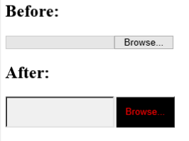
As of IE10 the file input button can be styled using the ::-ms-browse pseudo-element. Basically any CSS rules that you apply a regular button can be applied to the pseudo-element. For example:
<input type="file">
::-ms-browse {
    background: black;
    color: red;
    padding: 1em;
}
This displays as follows in IE10 on Windows 8:
WebKit
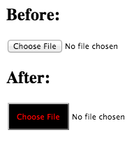
WebKit provides a hook for its file input button with the ::-webkit-file-upload-button pseudo-element. Again pretty much any CSS rule can be applied, therefore the Trident example will work here as well:
<input type="file">
::-webkit-file-upload-button {
    background: black;
    color: red;
    padding: 1em;
}
This displays as follows in Chrome 26 on OS X:
input[type=number]
WebKit
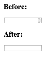
WebKit provides a spinner control by default for number picker inputs. Pseudo-elements ::-webkit-textfield-decoration-container, ::-webkit-inner-spin-button and ::-webkit-outer-spin-button are provided for customization. While you cannot do a whole lot with these elements, it can be useful to hide the spinner.
<input type="number">
::-webkit-textfield-decoration-container { }
::-webkit-inner-spin-button {
    -webkit-appearance: none;
}
::-webkit-outer-spin-button {
    -webkit-appearance: none;
}
This displays as follows in Chrome 26 on OS X:
input[type=password]
Trident
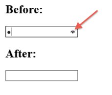
Trident provides a control on password inputs that can be pressed to display the password in plain text. This control is made customizable via the ::-ms-reveal pseudo-element. You can change a number of properties of the control including its color, background, or display to hide it. The following will hide the control:
<input type="password">
::-ms-reveal { display: none; }
This displays as follows in IE10 on Windows 8:
placeholder Attribute
Gecko
Gecko provides the pseduo-element ::-moz-placeholder to style placeholder text. You can use this to change the placeholder’s color or font properties. For example:
<input placeholder="placeholder">
::-moz-placeholder {
    color: blue;
    font-family: 'Comic Sans MS';
}
This displays as follows in Firefox 20 on OS X:
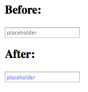
Note: Gecko switched from the pseudo-class :-moz-placeholder to the pseudo-element ::-moz-placeholder in Firefox 19.
Trident
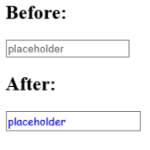
Trident offers the ability to style the placeholder text with a pseudo-class rather than a pseudo-element. However the pseudo-class, :-ms-input-placeholder, can be used the same as the pseudo-elements from the other rendering engines:
<input placeholder="placeholder">
:-ms-input-placeholder {
    color: blue;
    font-family: 'Comic Sans MS';
}
This displays as follows in IE10 on Windows 8:
WebKit
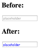
WebKit provides the ::-webkit-input-placeholder pseudo-element. It can also be used to change the color and font of the placeholder text:
<input placeholder="placeholder">
::-webkit-input-placeholder {
    color: blue;
    font-family: 'Comic Sans MS';
}
This displays as follows in Chrome 26 on OS X:
input[type=range]
Gecko
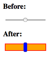
As of Firefox 22, Gecko provides pseudo-elements ::-moz-range-track and ::-moz-range-thumb for styling range inputs. It’s possible to apply most CSS rules to these elements, for example:
<input type="range">
::-moz-range-track {
    border: 2px solid red;
    height: 20px;
    background: orange;
}
::-moz-range-thumb {
    background: blue;
    height: 30px;
}
This displays as follows in Firefox 22 on OS X:
Trident
Trident provides an impressive number of pseudo-elements to customize its range selector.
::-ms-fill-lower: The track portion underneath / before the handle.::-ms-fill-upper: The track portion above / after the handle.::-ms-ticks-before: An area above / before the range track with tick marks.::-ms-ticks-after: An area below / after the range track with tick marks.::-ms-thumb: The handle.::-ms-track: The range track itself.::ms-tooltip: The tooltip that appears when the user is selecting a value with the range selector. Note that this element cannot be styled, only hidden usingdisplay: none.
This is easier to visualize with an example. Take the following:
<input type="range">
::-ms-fill-lower { background: orange; }
::-ms-fill-upper { background: green; }
::-ms-thumb { background: red; }
::-ms-ticks-after { display: block; color: blue; }
::-ms-ticks-before { display: block; color: black; }
::-ms-track { padding: 20px 0; }
::-ms-tooltip { display: none; /* display and visibility only */ }
This will display as follows in IE10 on Windows 8:

WebKit
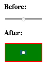
WebKit provides the ::-webkit-slider-runnable-track pseudo-element for the track and ::-webkit-slider-thumb for the range handle itself. While you cannot do much with these elements, you can add some colors and padding.
<input type="range">
::-webkit-slider-runnable-track {
    border: 2px solid red;
    background: green;
    padding: 2em 0;
}
::-webkit-slider-thumb {
    outline: 2px solid blue;
}
This displays as follows in Chrome 26 on OS X:
One final note about range inputs. Trident and Webkit allow you to apply hover states to the thumb pseudo-element (::-webkit-slider-thumb:hover and ::-ms-thumb:hover respectively), whereas Gecko currently does not.
input[type=reset]
Gecko
See <button>
input[type=search]
WebKit
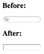
By default WebKit provides a custom UI for search inputs with cancel and search buttons. Two pseudo-elements, ::-webkit-search-cancel-button and ::-webkit-search-results-button are provided for customization, although you can’t much of anything with them other than hide them as shown below:
<input type="search">
/* Remove the rounded corners */
input[type=search] { -webkit-appearance: none; }

/* Hide the cancel button */
::-webkit-search-cancel-button { -webkit-appearance: none; }

/* Hide the magnifying glass */
::-webkit-search-results-button { -webkit-appearance: none; }
This displays as follows in Chrome 26 on OS X:
input[type=submit]
Gecko
See <button>
input[type=text]
Trident
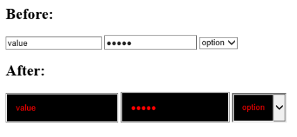
As of IE10 Trident provides the pseudo-element ::-ms-value to style the value portion of text inputs (input[type=text], input[type=password], etc) and <select>s. For example:
<input type="text" value="value">
<input type="password" value="value">
<select><option selected>option</option></select>
::-ms-value {
    color: red;
    background: black;
    padding: 1em;
}
This displays as follows in IE10 on Windows 8:
Clear Control
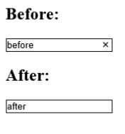
In IE10 when a text input has focus and is not empty, a small X control appears in the right hand side of the input. When clicked, the control will clear the contents of the text input. The X is styleable with the ::-ms-clear pseudo-element. Therefore you can hide it:
<input type="text">
::-ms-clear { display: none; }
This displays as follows in IE10 on Windows 8:
There are a variety of rules that ::-ms-clear will accept, so you can theme it as well:
<input type="text" value="Lorem Ipsum">
::-ms-clear {
    color: red;
    background: black;
    padding: 1em;
}
Which displays as follows:

<button> Element
Gecko
Gecko applies pseudo-elements ::-moz-focus-outer and ::-moz-focus-inner to inputs of type button, reset, and submit, as well as <button> elements.
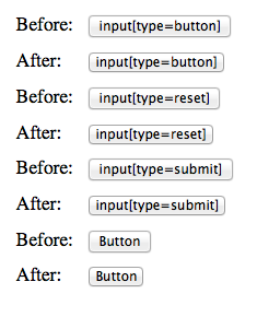
There’s not much you can do with these pseudo-elements, but there is one important thing to be aware of. Gecko applies padding and border to ::-moz-focus-inner by default:
button::-moz-focus-inner,
input[type="reset"]::-moz-focus-inner,
input[type="button"]::-moz-focus-inner,
input[type="submit"]::-moz-focus-inner,
input[type="file"] > input[type="button"]::-moz-focus-inner {
    border: 1px dotted transparent;
    padding: 0 2px;
}
These rules can easily create appearance differences between button displays in Gecko and other rendering engines. This is confusing and there’s actually a ticket to remove it. The ticket has been open since 2002 so don’t hold your breath.
The default padding and border can be reset by just setting them to 0:
button::-moz-focus-inner,
input::-moz-focus-inner {
    border: 0;
    padding: 0;
}
The before and after of this can be seen in the screenshot (below) of Firefox 19 on OS X:
<keygen> Element
WebKit
WebKit provides the ::-webkit-keygen-select that can be used to customize the dropdown that a keygen element uses. For example:
<keygen>
::-webkit-keygen-select {
    background: black;
    color: red;
}
This displays as follows on Chrome 26 on OS X:

<meter> Element
WebKit
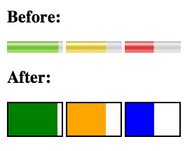
WebKit provides pseudo-elements ::-webkit-meter-bar, ::-webkit-meter-even-less-good-value, ::-webkit-meter-optimum-value, and ::-webkit-meter-suboptimal-value to customize the display of meter elements.
In order for the pseudo-elements to be styled, you must set -webkit-appearance to none on the meter element itself.
Only one of the ::-webkit-meter-even-less-good-value, ::-webkit-meter-optimum-value, and ::-webkit-meter-suboptimal-value elements will be active at a given time depending on the value of the meter.
See the following for an example:
<meter low="69" high="80" max="100" optimum="100" value="92">A</meter>
<meter low="69" high="80" max="100" optimum="100" value="72">C</meter>
<meter low="69" high="80" max="100" optimum="100" value="52">E</meter>
meter { -webkit-appearance: none; }
::-webkit-meter-bar {
    height: 50px;
    background: white;
    border: 2px solid black;
}
::-webkit-meter-optimum-value { background: green; }
::-webkit-meter-suboptimum-value { background: orange; }
::-webkit-meter-even-less-good-value { background: blue; }
This displays as follows in Chrome 26 on OS X:
<progress> Element
WebKit
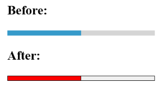
WebKit provides pseudo-elements ::-webkit-progress-inner-element, ::-webkit-progress-bar, & ::-webkit-progress-value to style progress elements in the following hierarchy:

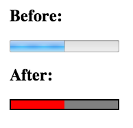
Like meter, in order to apply any rules to these elements you must set -webkit-appearance: none; on the progress element. Here’s an example:
<progress max="100" value="50"></progress>
progress { -webkit-appearance: none; }
::-webkit-progress-inner-element { }
::-webkit-progress-bar { border: 2px solid black; }
::-webkit-progress-value { background: red; }
This displays as follows in Chrome 26 on OS X:
Gecko
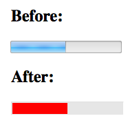
Gecko provides a ::-moz-progress-bar pseudo-element to style the progress bar itself. For example:
<progress max="100" value="50"></progress>
::-moz-progress-bar { background: red; }
This displays as follows in Firefox 19 on OS X:
Trident
Like Gecko, Trident provides a single pseudo-element to style the progress bar, ::-ms-fill. For example:
<progress max="100" value="50"></progress>
::-ms-fill { background: red; }
This displays as follows in IE10 on Windows 8:
<select> Element
Trident
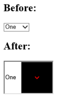
As of IE10 Trident gives you a hook to style the arrow within select dropdowns, ::-ms-expand. For example:
<select>
    <option selected>One</option>
</select>
::-ms-expand {
    padding: 2em;
    color: red;
    background: black;
}
This displays as follows in IE10 on Windows 8:
<textarea> Element
WebKit
WebKit provides the pseudo-element ::-webkit-resizer for the resize control it automatically adds to the bottom right of textarea elements.
It can be hidden by applying display: none or -webkit-appearance: none:
<textarea></textarea>
::-webkit-resizer {
    display: none;
}
This displays as follows in Chrome 26 on OS X:
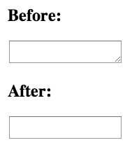
Note: Adding display: none to ::-webkit-resizer doesn’t actually prevent the user from resizing the textarea, it just hides the control. If you want to disable resizing, set the resize CSS property to none. This also hides the control and has the added benefit of working in all browsers that support resizing textareas.
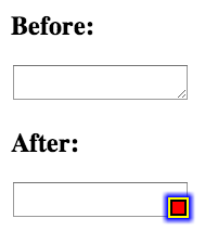
The ::-webkit-resizer pseudo-element also allows for some basic styling. If you thought the resize control could use significantly more color you could add this:
<textarea></textarea>
::-webkit-resizer {
    border: 2px solid black;
    background: red;
    box-shadow: 0 0 5px 5px blue;
    outline: 2px solid yellow;
}
This displays as follows in Chrome 26 on OS X:
Form Validation Messages
WebKit
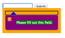
WebKit is the only rendering engine to support styling the validation bubbles created from the constraint validation API. The following pseudo-elements are provided:
::-webkit-validation-bubble::-webkit-validation-bubble-arrow::-webkit-validation-bubble-arrow-clipper::-webkit-validation-bubble-heading::-webkit-validation-bubble-message::-webkit-validation-bubble-text-block
It’s easier to see what each element does visually. Here’s an example:
::-webkit-validation-bubble { padding: 1em; background: orange; }
::-webkit-validation-bubble-arrow { background: blue; }
::-webkit-validation-bubble-arrow-clipper { border: 2px solid black; }
::-webkit-validation-bubble-heading { background: green; }
::-webkit-validation-bubble-message { color: white; background: purple; }
::-webkit-validation-bubble-text-block { border: 1px solid red; padding: 1em; }
This displays as follows in Chrome 26 on OS X:
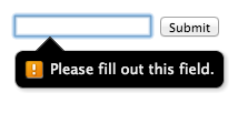
Here’s a slightly more practical example showing how the bubble can be themed:
::-webkit-validation-bubble-message {
    color: #eee;
    background: black;
}
::-webkit-validation-bubble-arrow {
    background: black;
    border-color: #444;
    box-shadow: none;
}
This displays as follows in Chrome 26 on OS X:
That’s It!
Hopefully you will find this list helpful. If I’m missing elements or some of this information gets out of date let me know in the comments.
Resources
- https://gist.github.com/afabbro/3759334: A gist from @angelinamagnum with a nice list of ALL WebKit pseudo-elements. (@paul_irish actually
ack‘d the WebKit code base.) - http://www.wufoo.com/html5/: Wufoo’s Current State of HTML Forms
- https://developer.mozilla.org/en-US/docs/CSS/CSS_Reference/Mozilla_Extensions: MDN article on Mozilla’s CSS Extensions
- http://dev.bowdenweb.com/css/pseudo/ms-trident-vendor-prefixed-pseudo-elements.html: List of Trident Vendor-Prefixed Pseudo-Elements
- http://trac.webkit.org/browser/trunk/Source/WebCore/css/html.css: WebKit’s current user agent stylesheet
- http://trac.webkit.org/wiki/Styling%20Form%20Controls: Slightly dated guide from WebKit on styling form controls
Updates
- April 17th, 2013: Added sections on
::-moz-focus-outerand::-moz-focus-innerper comments from Matthew Brundage. 5a776e9edb02d78b0f4e9880523f0752ccf24c3f. - April 20th, 2013: Added a section on
::-webkit-resizerfor textareas per comments from Anselm Urban. 4c37198821fda83dedac061ac282b532b7f7ce81 - April 26th, 2013: Added a note that the
resizeCSS property is the appropriate way to prevent textareas from being resized. f90720f3aa12c3ec4ca922b5d22f64f03583eb4f - October 7th, 2013: Note that Chrome 28 removed the ability to style validation bubbles. 372393f46419abd3bb882ce529ec71948442be56
